NEW YORK’S MOST UNIQUE STEAKHOUSE
Beneath the New Yorker Hotel in New York City’s Midtown Manhattan lies Butcher & Banker. The space takes advantage of a beautifully restored 1930’s bank vault which was left over from the Manufacturers Hanover Bank, located within the old Art Deco building. The identity for this restaurant needed to reflect the space’s great history while integrating a modern day spin and care-free spirit.
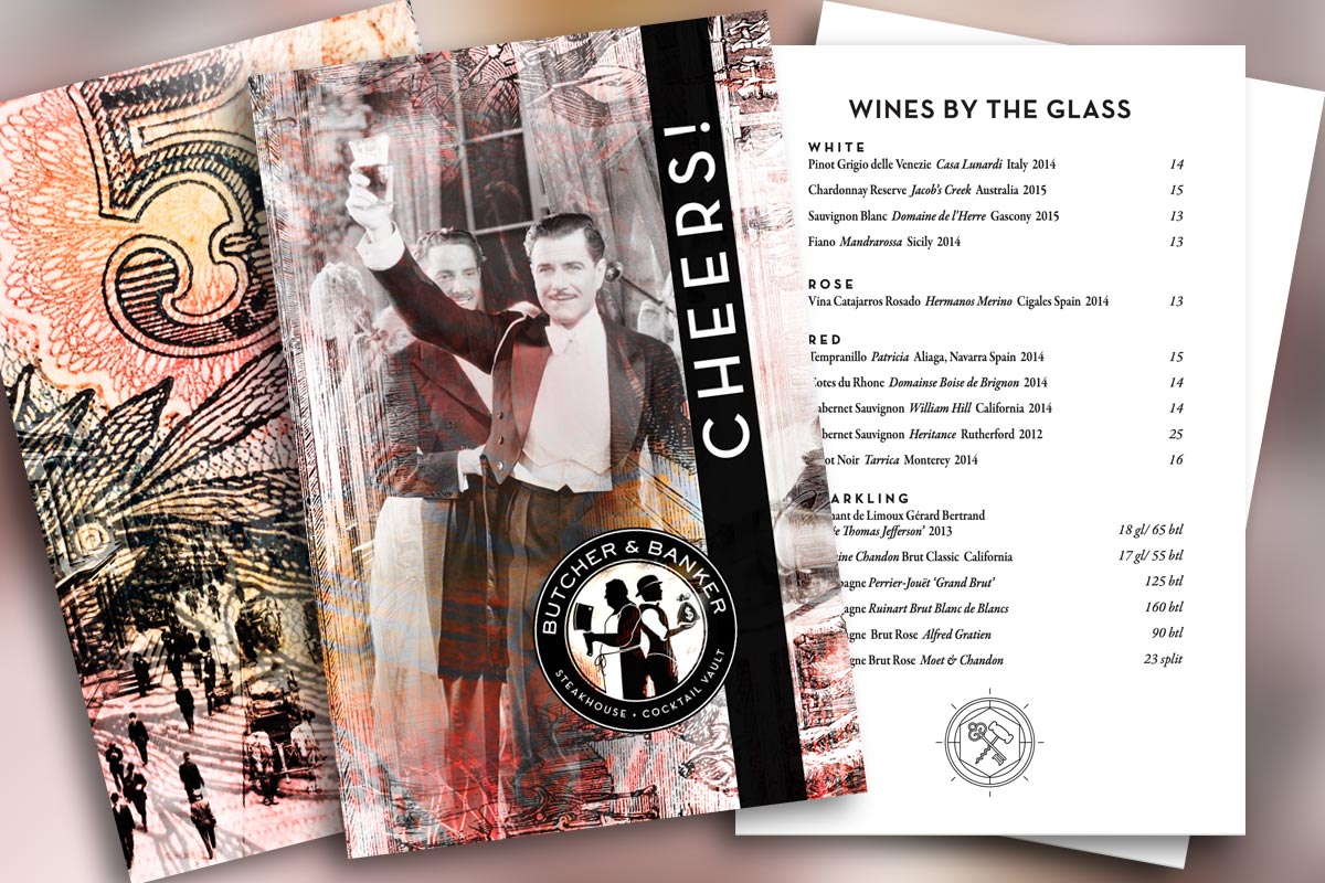
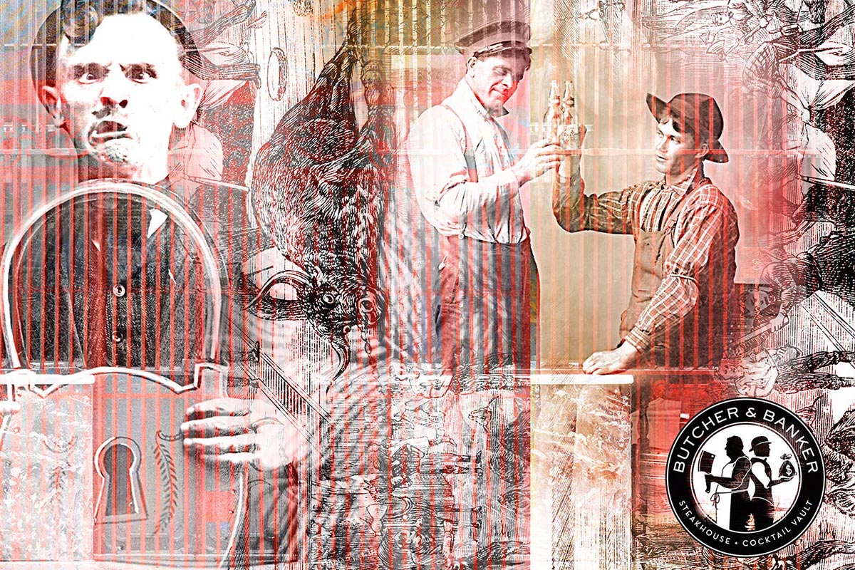
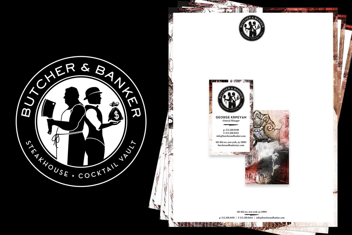
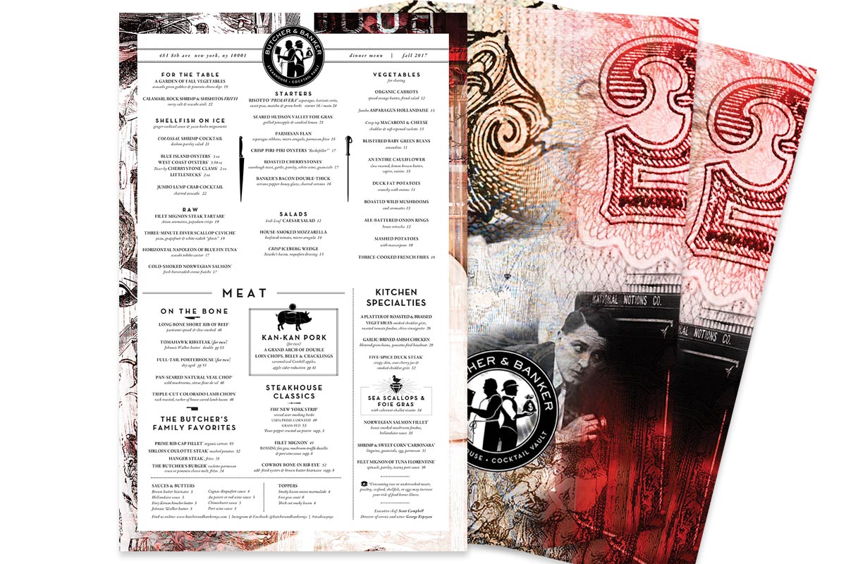
J Wright Design designed the two characters, the butcher and the banker, as a starting point to develop the Art Deco inspired branding. Coupled with beautiful collages of various themes from an earlier era, JWD designed a complete restaurant package from the menus to signage to the website.
CLIENT
Butcher & Banker // New York, New York
Assignment
Brand Strategy, Logo Design, Graphic Development, Packaging, Advertising, Stationary, Menu Design, Website, Signage.
A sense of humor and a unique space
Designing Butcher & Banker
How do we put a new spin on a classic steakhouse? How do we integrate the bank vault and Art Deco history? How do we keep things fresh and fun instead of stale and stodgy? How do we attract the midtown commuter, convention and hotel crowd and still appeal to the gastronomic foodies?
The Solution
A Design to compliment the space, not compete with it.
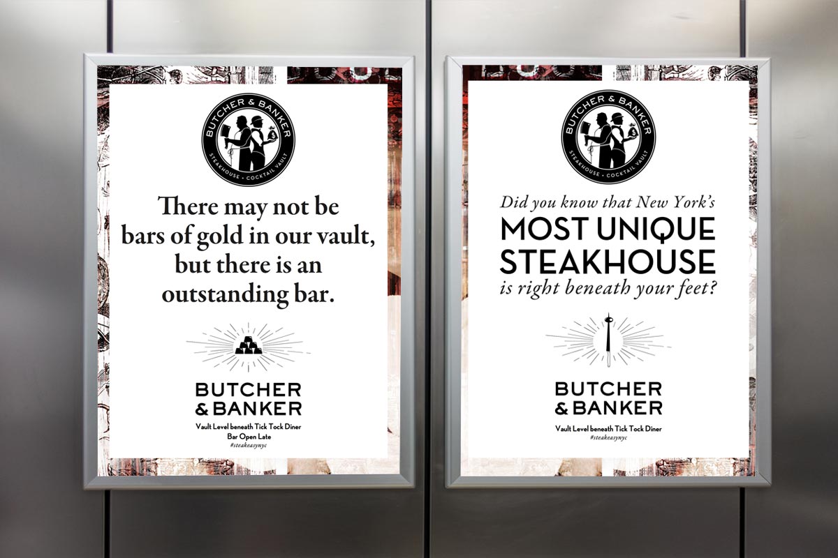
The design came down to recognizing that the food and the space were the stars of the show and that the branding simply needed to help set the tone. The colors are mostly black and white to reflect the historical nature of the space, and gives a classy confident tone. Where color is used, reds and golds were the focus complimenting the fabrics of the space and brass of the bank vault. The main dinner menu was designed to be taken home (as a small memento for the hotel guests) and the wine and cocktail lists set the tone for celebration. Punchy yet simple advertising for the hotel elevators and clean straight-forward signage round out the restaurant’s branding.

